8.1 Understanding the Nature and Severity of Missing Information
As illustrated throughout this book, visualizing data are an important tool for guiding us towards implementing appropriate feature engineering techniques. The same principle holds for understanding the nature and severity of missing information throughout the data. Visualizations as well as numeric summaries are the first step in grasping the challenge of missing information in a data set. For small to moderate data (100’s of samples and 100’s of predictors), several techniques are available that allow the visualization of all of the samples and predictors simultaneously for understanding the degree and location of missing predictor values. When the number of samples or predictors become large, the missing information must first be appropriately condensed and then visualized. In addition to visual summaries, numeric summaries are a valuable tool for diagnosing the nature and degree of missingness.
Visualizing Missing Information
When the training set has a moderate number of samples and predictors, a simple method to visualize the missing information is with a heatmap. In this visualization the figure has two colors representing the present and missing values. The top of Figure 8.1 illustrates a heatmap of missing information for the animal scat data. The heatmap visualization can be reorganized to highlight commonalities across missing predictors and samples using hierarchical cluster analysis on the predictors and on the samples (Dillon and Goldstein 1984). This visualization illustrates that most predictors and samples have complete or nearly complete information. The three morphological predictors (diameter, taper, and taper index) are more frequently missing. Also two samples are missing all three of the laboratory measurements (d13N, d15N, and CN).
A co-occurrence plot can further deepen the understanding of missing information. This type of plot displays the frequency of missing predictor combinations (Figure 8.1). As the name suggests, a co-occurrence plot displays the frequencies of the most common missing predictor combinations. The figure makes it easy to see that TI, Tapper, and Diameter have the most missing values, that Tapper and TI are missing together most frequently, and that six samples are missing all three of the morphological predictors. The bottom of Figure 8.1 displays the co-occurrence plot for the scat data.


Figure 8.1: Visualizations of missing data patters than examine the entire data set (top) or the co-occurance of missing data across variables (bottom).
In addition to exploring the global nature of missing information, it is wise to explore relationships within the data that might be related to missingness. When exploring pairwise relationships between predictors, missing values of one predictor can be called out on the margin of the alternate axis. For example, Figure 8.2 shows the relationship between the diameter and mass of the feces. Hash marks on either axis represent samples that have an observed value for that predictor but have a missing value for the corresponding predictor. The points are colored by whether the sample was a “flat puddle that lacks other morphological traits.” Since the missing diameter measurements have this unpalatable quality, it makes sense that some shape attributes cannot be determined. This can be considered to be structurally missing, but there still may be a random or informative component to the missingness.

Figure 8.2: A scatter plot of two predictors colored by the value of a third. The rugs on the two axes show where that variable’s values occur when the predictor on the other axis is missing.
However, in relation to the outcome, the six flat samples were spread across the gray fox (\(n=5\)) and coyote (\(n=1\)) data. Given the small sample size, it is unclear if this missingness is related to the outcome (which would be problematic). Subject-matter experts would need to be consulted to understand if this is the case.
When the data has a large number of samples or predictors, using heatmaps or co-occurrence plots are much less effective for understanding missingness patterns and characteristics. In this setting, the missing information must first be condensed prior to visualization. Principal component analysis (PCA) was first illustrated in Section 6.3 as a dimension reduction technique. It turns out that PCA can also be used to visualize and understand the samples and predictors that have problematic levels of missing information. To use PCA in this setting, the predictor matrix is converted to a binary matrix where a zero represents a non-missing value and a one represents a missing value. Because PCA searches for directions that summarize maximal variability, the initial dimensions capture variation caused by the presence of missing values. Samples that do not have any missing values will be projected onto the same location close to the origin. Alternatively, samples with missing values will be projected away from the origin. Therefore by simply plotting the scores of the first two dimensions, we can begin to identify the nature and degree of missingness in large data sets.
The same approach can be applied to understanding the degree of missingness among the predictors. To do this, the binary matrix representing missing values is first transposed so that predictors are now in the rows and the samples are in the columns. PCA is then applied to this matrix and the resulting dimensions now capture variation cause by the presence of missing values across the predictors.

Figure 8.3: A scatter plot of the first two row scores from a binary representation of missing values for the Chicago ridership data to identify patterns of missingness over dates.
To illustrate this approach, we will return to the Chicago train ridership data which has ridership values for 5,733 days and 137 stations. The missing data matrix can be represented by dates and stations. Applying PCA to this matrix generates the first two components illustrated in Figure 8.3. Points in the plot are sized by the amount of missing stations. In this case each day had at least one station that had a missing value, and there were 8 distinct missing data patterns.
Further exploration found that many of the missing values occurred during September 2013. The cause of these missing values should be investigated further.

Figure 8.4: A scatter plot of the first two column scores from a binary representation of missing values for the Chicago ridership data to identify patterns is stations.
To further understand the degree and location of missing values, the data matrix can be transformed and PCA applied again. Figure 8.4 presents the scores for the stations. Here points are labeled by the amount of missing information across stations. In this case, 2 stations have a substantial amount of missing data. The root cause of missing values for these stations should be investigated to better determine an appropriate way for handing these stations.
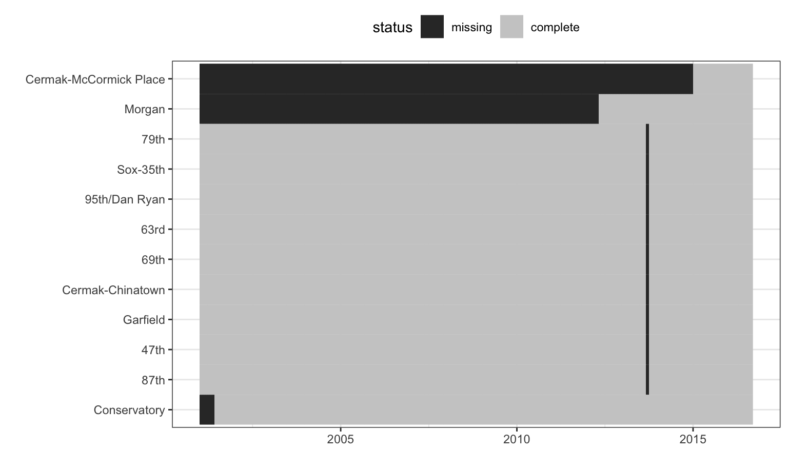
Figure 8.5: Missing data patterns for stations originally in the Chicago ridership data.
The stations with excessive missingness and their missing data patterns over time are shown in Figure 8.5. The station order is set using a clustering algorithm while the x-axis is ordered by date. There are nine stations whose data are almost complete except for a single month gap. These stations are all on the Red Line and occur during the time of the Red Line Reconstruction Project that affected stations north of Cermak-Chinatown to the 95th Street station. The Conservatory station opened in 2001 and the Morgan station opened in mid-2012, which explains the missing data prior to these respective dates.
Summarizing Missing Information
Simple numerical summaries are effective at identifying problematic predictors and samples when the data become too large to visually inspect. On a first pass, the total number or percent of missing values for both predictors and samples can be easily computed. Returning to the animal scat data, Table 8.1 presents the predictors by amount of missing values. Similarly, Table 8.2 contains the samples by amount of missing values. These summaries can then be used for investigating the underlying reasons why values are missing or as a screening mechanism for removing predictors or samples with egregious amounts of missing values.
| Percent Missing (%) | Predictor |
|---|---|
| 0.909 | Mass |
| 1.818 | d13C, d15N, and CN |
| 5.455 | Diameter |
| 15.455 | Taper and TI |
| Percent Missing (%) | Sample Numbers |
|---|---|
| 10.5 | 51, 68, 69, 70, 71, 72, 73, 75, 76, and 86 |
| 15.8 | 11, 13, 14, 15, 29, 60, 67, 80, and 95 |