6.3 Many:Many Transformations
When creating new features from multiple predictors, there is a possibility of correcting a variety of issues such as outliers or collinearity. It can also help reduce the dimensionality of the predictor space in ways that might improve performance and reduce computational time for models.
6.3.1 Linear Projection Methods
Observational or available data sets nowadays contain many predictors, and often more than the number of available samples. The predictors are usually any measurements that may have a remote chance of potentially being related the response. A conventional thought process is that the more predictors that are included, the better chance the model will have to find the signal. But this is not the case; including irrelevant predictors can have detrimental effects on the final model (see Chapter 10). The negative impacts include: increasing the computational time required for training a model, decreasing the predictive performance, and complicating the predictor importance calculation. By including any potential predictor, we end up with a sub-optimal model. This is illustrated in Section 10.3.
The tension in working with modern data is that we often do not fully know which predictors are relevant to the response. What may in fact be true is that some of the available predictors (or combinations) have a meaningful association with the response. Under these conditions, the task is to try to identify the simple or complex combination that is relevant to the response.
This section will cover projection methods that have been been shown to effectively identify meaningful projections of the original predictors. The specific techniques discussed here are principal components analysis (PCA), kernel PCA, independent component analysis (ICA), non-negative matrix factorization (NNMF), and partial least squares (PLS). The first four techniques in this list are unsupervised techniques that are ignorant of the response. The final technique uses the response to direct the dimension reduction process so that the reduced predictor space is optimally associated with the response.
These methods are linear in the sense that they take a matrix of numeric predictor values (\(X\)) and create new components that are linear combinations of the original data. These components are usually called the scores. If there are \(n\) training set points and \(p\) predictors, the scores could be denoted as the \(n \times p\) matrix \(X^*\) and are created using
\[ X^* = X A \]
where the \(p \times p\) matrix \(A\) is often called the projection matrix. As a result, the value of the first score for data point i would be:
\[ x^*_{i1} = a_{11} x_{i1} + a_{21}x_{i2} + \ldots + a_{p1}x_{ip} \]
One possibility is to only use a portion of \(A\) to reduce the number of scores down to \(k < p\). For example, it may be that the last few columns of \(A\) show no benefit to describing the predictor set. This notion of dimension reduction should not be confused with feature selection. If the predictor space can be described with \(k\) score variables, there are less features in the data given to the model but each of these columns is a function of all of the original predictors.
The differences between the projection methods mentioned above57 is in how the projection values are determined.
As will be shown below, each of the unsupervised techniques has its own objective for summarizing or projecting the original predictors into a lower dimensional subspace of size \(k\) by using only the first \(k\) columns of \(A\). By condensing the predictor information, the predictor redundancy can be reduced and potential signals (as opposed to the noise) can be teased out within the subspace. A direct benefit of condensing information to a subspace of the predictors is a decrease in the computational time required to train a model. But employing an unsupervised technique does not guarantee an improvement in predictive performance. The primary underlying assumption when using an unsupervised projection method is that the identified subspace is predictive of the response. This may or may not be true since the objective of unsupervised techniques is completely disconnected with the response. At the conclusion of model training, we may find that unsupervised techniques are convenient tools to condense the original predictors, but do not help to effectively improve predictive performance58.
The supervised technique, PLS, improves on unsupervised techniques by focusing on the objective of finding a subspace of the original predictors that is directly associated with the response. Generally, this approach finds a smaller and more efficient subspace of the original predictors. The drawback of using a supervised method is that a larger data set is required to reserve samples for testing and validation to avoid overfitting.
6.3.1.1 Principal Component Analysis
Principal components analysis was introduced earlier as an exploratory visualization technique in Section 4.2.7. We will now explore PCA in more detail and investigate how and when it can be effectively used to create new features. Principal component analysis was originally developed by Karl Pearson more than a century ago and, despite its age, is still one of the most widely used dimension reduction tools. A good reference for this method is Abdi and Williams (2010). Its relevance in modern data stems from the underlying objective of the technique. Specifically, the objective of PCA is to find linear combinations of the original predictors such that the combinations summarize the maximal amount of variation in the original predictor space. From a statistical perspective, variation is synonymous with information. So, by finding combinations of the original predictors that capture variation, we find the subspace of the data that contains the information relevant to the predictors. Simultaneously, the new PCA scores are required to be orthogonal (i.e., uncorrelated) to each other. The property of orthogonality enables the predictor space variability to be neatly partitioned in a way that does not overlap. It turns out that the variability summarized across all of the principal components is exactly equal to the variability across the original predictors. In practice, enough new score variables are computed to account for some pre-specified amount of the variability in the original predictors (e.g., 95%).
An important side benefit of this technique is that the resulting PCA scores are uncorrelated. This property is very useful for modeling techniques (e.g., multiple linear regression, neural networks, support vector machines, and others) that need the predictors to be relatively uncorrelated. This is discussed again in the context of ICA below.
PCA is a particularly useful tool when the available data are composed of one or more clusters of predictors that contain redundant information (e.g., predictors that are highly correlated with one another). Predictors that are highly correlated can be thought of as existing in a lower dimensional space than the original data. As a trivial example, consider the scatter plot in Figure 6.7 (a), where two predictors are linearly related. While these data have been measured in two dimensions, only one dimension is needed (a line) to adequately summarize the position of the samples. That is, these data could be nearly equivalently represented by a combination of these two variables as displayed in part (b) of the figure. The red points in this figure are the orthogonal projections of the original data onto the first principal component score (imagine the diagonal line being rotated to horizontal). The new feature represents the original data by one numeric value which is the distance from the origin to the projected value. After creating the first PCA score, the “leftover” information is represented by the length of the blue lines in panel (b). These distances would be the final score (i.e., the second component).

Figure 6.7: Principal component analysis of two highly correlated predictors. (a) A scatter plot of two highly correlated predictors with the first principal direction represented with a dashed line. (b) The orthogonal projection of the original data onto the first principal direction. The new feature is represented by the red points.
For this simple example, a linear regression model was built using the two correlated predictors. A linear regression model was also built between the first principal component score and the response. Figure 6.8 provides the relationship between the observed and predicted values from each model. For this example, there is virtually no difference in performance between these models.

Figure 6.8: A linear combination of the two predictors chosen to summarize the maximum variation contains essentially the same information as both of the original predictors.
Principal component regression, which describes the process of first reducing dimension and then regressing the new component scores onto the response is a stepwise process (Massy 1965). The two steps of this process are disjoint which means that the dimension reduction step is not directly connected with the response. Therefore, the principal component scores associated with the variability in the data may or may not be related to the response.
To provide a practical example of PCA, let’s return to the Chicago ridership data that we first explored in Chapter 4. Recall that ridership across many stations was highly correlated (Figure 4.9). Of the 125 stations, 94 had at least one pairwise correlation with another station greater than 0.9. What this means is that if the ridership is known at one station, the ridership at many other stations can be estimated with a high degree of accuracy. In other words, the information about ridership is more simply contained in a much lower dimension of these data.
The Chicago data can be used to demonstrate how projection methods work. Recall that the main driving force in the data are differences between weekend and weekday ridership. The gulf between the data for these two groups completely drives the principal component analysis since it accounts for most of what is going on in the data. Rather than showing this analysis, the weekend data were analyzed here59. There were 1628 days on either Saturday or Sunday in the training data. Using only the 14-day lag predictors, PCA was conducted on the weekend data after the columns were centered and scaled.
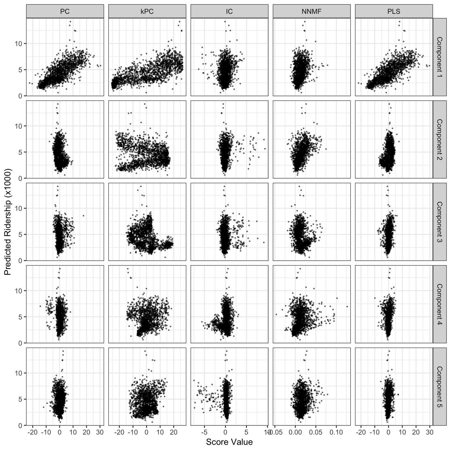
Figure 6.9: Score values from several linear projection methods for the weekend ridership at Clark and Lake. The x-axis values are the scores for each method and the y-axis is ridership (in thousands).
The left-most column of Figure 6.9 shows the first five components and their relationships to the outcome. The first component, which accounts for 60.4% of the variation in the lagged predictors, shows a strong linear relationship with ridership. For this component, all of the coefficients of the projection matrix \(A\) corresponding to this linear combination are positive and five most influential stations were 35th/Archer, Ashland, Austin, Oak Park, and Western60. The five least important stations, to the first component, were Central, O’Hare, Garfield, Linden, and Washington/Wells.
The second component only accounts for 5% of the variability and has less correlation with the outcome. In fact, the remaining components capture smaller and smaller amounts of information in the lagged predictors. To cover 95% of the original information, a total of 36 principal components would be required.
One important question that PCA might help answer is “Is there a line effect on the weekends?” To help answer this, the first five components are visualized in Figure 6.10 using a heatmap. In the heatmap, the color of the points represent the signs and magntiude of the elements of \(A\). The rows have been reordered based on a clustering routine that uses the five components. The row labels show the line (or lines) for the corresponding station. Hovering over a cell in the heatmap shows the station name, lines, and projection coeffcieint.
Figure 6.10: A heatmap of the first five principal component coefficients. The rows are clustered using all five components. Clicking on the point shows the station, line, and coefficient value.
The first column shows that the relative weight for each station to the first component is reliably positive and small (in comparison to the other components); there is no line effect in the main underlying source of information. The other components appear to isolate specific lines (or subsets within lines). For example, the second component is strongly driven by stations along the Pink line (the dark red section), a section of the Blue line going towards the northwest, and a portion of the Green line that runs northbound of the city. Conversely, the fourth component has a strong negative cluster for the same Green line stations. In general, the labels along the y-axis show that the lines are fairly well clustered together, which indicates that there is a line effect after the first component’s effects are removed.
Despite the small amount of variation that the second component captures, we’ll use these coefficients in \(A\) to accentuate the geographic trends in the weekend data. The second PCA component’s rotation values have both positive and negative values. Their sign and magnitude can help inform us as to which stations are driving the this component. As seen in Figure 6.11, the stations on the Red and Purple lines61 that head due north along the coast have substantial positive effects on the second component. Southwestern stations along the Pink line have large negative effects (as shown by the larger red markers) as did the O’Hare station (in the extreme northwest). Also, many of the stations clustered around Clark and Lake have small or moderately negative effects on the second station. It is interesting that two stations in close proximity to one another, Illinois Medical District and Polk, have substantial effects on the component but have opposing signs. These two stations are on different lines (Blue and Pink, respectively) and this may be another indication that there is a line effect in the data once the main piece of information in the data (i.e, the first component) is removed.
Figure 6.11: Coefficients for the second principal components. The size is relative magnitude of the coefficient while red indicates negativity, blue is positivity, and white denotes values near zero. Clicking on the point shows the station, line, and absolute rank.
There are a variety of methods for visualizing the PCA results. It is common to plot the first few scores against one another to look for separation between classes, outliers, or other interesting patterns. Another visualization is the biplot (Greenacre 2010), an informative graphic that overlays the scores along with the coefficients of \(A\). In our data, there are 126 highly correlated stations involved in the PCA analysis and, in this case, the biplot is not terribly effective.
Finally, it is important to note that since each PCA component captures less and less variability, it is common for the scale of the scores to become smaller and smaller. For this reason, it is important to plot the component scores on a common axis scale that accounts for all of the data in the scores (i.e., the largest possible range). In this way, small patterns in components that capture a small percentage of the information in the data will not be over-interpreted.
6.3.1.2 Kernel Principal Component Analysis
Principal component analysis is an effective dimension reduction technique when predictors are linearly correlated and when the resulting scores are associated with the response. However, the orthogonal partitioning of the predictor space may not provide a good predictive relationship with the response, especially if the true underlying relationship between the predictors and the response is non-linear. Consider, for example, a hypothetical relationship between a response (\(y\)) and two predictors (\(x_1\) and \(x_2\)) as follows:
\[ y = x_1 + x^{2}_{1} + x_2 + x^{2}_{2} + \epsilon \] In this equation \(\epsilon\) represents random noise. Suppose also that the correlation between \(x_1\) and \(x_2\) is strong as in Figure 6.7. Applying traditional PCA to this example would summarize the relationship between \(x_1\) and \(x_2\) into one principal component. However this approach would ignore the important quadratic relationships that would be critically necessary for predicting the response. In this two-predictor example, a simple visual exploration of the predictors and the relationship between the predictors and the response would lead us to understanding that the quadratic versions of the predictors are required for predicting the relationship with the response. But the ability to visually explore important higher-order terms diminishes as the dimension of the data increases. Therefore traditional PCA will be a much less effective dimension reduction technique when the data should be augmented with additional features.
If we knew that one or more quadratic terms were necessary for explaining the response, then these terms could be added to the predictors to be evaluated in the modeling process. Another approach would be to use a nonlinear basis expansion as described earlier in this chapter. A third possible approach is kernel PCA (Schölkopf, Smola, and Müller 1998; Shawe-Taylor and Cristianini 2004). The kernel PCA approach combines a specific mathematical view of PCA with kernel functions and the kernel ‘trick’ to enable PCA to expand the dimension of the predictor space in which dimension reduction is performed (not unlike basis expansions). To better understand what kernel PCA is doing, we first need to recognize that variance summarization problem posed by PCA can be solved by finding the eigenvalues and eigenvectors of the covariance matrix of the predictors. It turns out that the form of the eigen decomposition of the covariance matrix can be equivalently written in terms of the inner product of the samples. This is know as the ‘dual’ representation of the problem. The inner-product is referred to as the linear kernel; the linear kernel between \(x_{1}\) and \(x_{2}\) is represented as:
\[ k\left(\mathbf{x}_{1},\mathbf{x}_{2} \right) = \langle \mathbf{x}_{1},\mathbf{x}_{2} \rangle = \mathbf{x}^{T}_1\mathbf{x}_2 \]
For a set of \(i = 1 \ldots n\) samples and two predictors, this corresponds to
\[ k\left(\mathbf{x}_{1},\mathbf{x}_{2} \right) = x_{11}x_{12} + \ldots + x_{n1}x_{n2} \]
Kernel PCA then uses the kernel substitution trick to exchange the linear kernel with any other valid kernel. For a concise list of kernel properties for constructing valid kernels, see Bishop (2011). In addition to the linear kernel, the basic polynomial kernel has one parameter, \(d\) and is defined as:
\[ k\left(\mathbf{x}_{1},\mathbf{x}_{2} \right) = \langle \mathbf{x}_{1},\mathbf{x}_{2} \rangle^d \] Again, with two predictors and \(d = 2\):
\[ k\left(\mathbf{x}_{1},\mathbf{x}_{2} \right) = (x_{11}x_{12} + \ldots + x_{n1}x_{n2})^2 \] Using the polynomial kernel, we can directly expand a linear combination as a polynomial of degree \(d\) (similar to what was done in for basis functions in Section 6.2.1).
The radial basis function (RBF) kernel has one parameter, \(\sigma\) and is defined as:
\[ k\left(\mathbf{x}_{1},\mathbf{x}_{2} \right) = \exp\left( -\frac{\lVert \mathbf{x}_{1} - \mathbf{x}_{2} \rVert^2}{2\sigma^2} \right)\]
The RBF kernel is also known as the Gaussian kernel due to its mathematical form and its relationship to the normal distribution. The radial basis and polynomial kernels are popular starting points for kernel PCA.
Utilizing this view enables the kernel approach to expand the original dimension of the data into high dimensions that comprise potentially beneficial representations of the original predictors. What’s even better is that the kernel trick side-steps the need to go through the hassle of creating these terms in the \(X\) matrix (as one would with basis expansions). Simply using a kernel function and solving the optimization problem directly explores the higher dimensional space.

Figure 6.12: A comparison of PCA and kernel PCA. (a) The training set data. (b) The simulated relation between \(x_1\) and the outcome. (c) The PCA results (d) kPCA using a polynomial kernel shows better results. (e) Residual distributions for the two dimension reduction methods.
To illustrate the utility of kernel PCA, we will simulate data based on the model earlier in this section. For this simulation, 200 samples were generated, with 150 selected for the training set. PCA and kernel PCA will be used separately as dimension reduction techniques followed by linear regression to compare how these methods perform. Figure 6.12(a) displays the relationship between \(x_1\) and \(x_2\) for the training data. The scatter plot shows the linear relationship between these two predictors. Panel (b) uncovers the quadratic relationship between \(x_1\) and y which could be easily be found and incorporated into a model if there were a small number of predictors. PCA found one dimension to summarize \(x_1\) and \(x_2\) and the relationship between the principal component and the response is presented in Figure 6.12(c). Often in practice, we use the number of components that summarize a threshold amount of variability as the predictors. If we blindly ran principal component regression, we would get a poor fit between \(PC_1\) and \(y\) because these data are better described by a quadratic fit. The relationship between the response and the first component using a polynomial kernel of degree 2 is presented in panel (d). The expansion of the space using this kernel allows PCA to better find the underlying structure among the predictors. Clearly, this structure has a more predictive relationship with the response than the linear method. The model performance on the test is presented in panel (e) where the distirbution of the residuals from the kernel PCA model are demonstrably smaller than those from the PCA model.
For the Chicago data, a radial basis function kernel was used to get new PCA components. The kernel’s only parameter (\(\sigma\)) was estimated analytically using the method of Caputo et al. (2002); values between 0.002 and 0.022 seemed reasonable and a value near the middle of the range (0.006) was used to compute the components. Sensitivity analysis was done to assess if others choices within this range led to appreciably different results, which they did not. The second column from the left in Figure 6.9 shows the results. Similar to ordinary PCA, the first kPCA components has a strong association with ridership. However, the kernel-based component has a larger dynamic range on the x-axis. The other components shown in the figure are somewhat dissimilar from regular PCA. While these scores have less association with the outcome (in isolation), it is very possible that, when the scores are entered into a regression model simultaneously, they have predictive utility.
6.3.1.3 Independent Component Analysis
PCA seeks to account for the variation in the data and produces components that are mathematically orthogonal to each other. As a result, the components are uncorrelated. However, since correlation is a measure of linear independence between two variables, they may not be statistically independent of one another (i.e., have a covariance of zero). There are a variety of toy examples of scatter plots of uncorrelated variables containing a clear relationship between the variables. One exception occurs when the underlying values follow a Gaussian distribution. In this case, uncorrelated data would also be statistically independent62.
Independent component analysis (ICA) is similar to PCA in a number of ways (Lee 1998). It creates new components that are linear combinations of the original variables but does so in a way that the components are as statistically independent from one another as possible. This enables ICA to be able to model a broader set of trends than PCA, which focuses on orthogonality and linear relationships. There are a number of ways for ICA to meet the constraint of statistically independence and often the goal is to maximize the “non-Gaussianity” of the resulting components. There are different ways to measure non-Gaussianity and the fastICA approach uses an information theory called negentropy to do so (Hyvarinen and Oja 2000). In practice, ICA should create components that are dissimilar from PCA unless the predictors demonstrate significant multivariate normality or strictly linear trends. Also, unlike PCA, there is no unique ordering of the components.
It is common to normalize and whiten the data prior to running the ICA calculations. Whitening, in this case, means to convert the original values to the full set of PCA components. This may seem counter-intuitive, but this preprocessing doesn’t negatively affect the goals of ICA and reduces the computational complexity substantially (Roberts and Everson 2001). Also, the ICA computations are typically initialized with random parameter values and the end result can be sensitive to these values. To achieve reproducible results, it is helpful to initialize the values manually so that the same results can be re-created at some later time.
ICA was applied to the Chicago data. Prior to estimating the components, the predictors were scaled so that the pre-ICA step of whitening used the centered data to compute the initial PCA data. When scaling was not applied, the ICA components were strongly driven by different individual stations. The ICA components are shown in the third column of Figure 6.9 and appear very different from the other methods. The first component has very little relationship with the outcome and contains a set of outlying values. In this component, most stations had little to no contribution to the score. Many stations that had an effect were near Clark and Lake. While there were 42 stations that negatively affected the component (the strongest being Chicago, State/Lake, and Grand) most have positive coefficients (such as Clark/Division, Irving Park, and Western). For this component, the other important stations were along the Brownline (going northward) as well as the station for Rosemont (just before O’Hare airport). The other ICA components shown in Figure 6.9 had very weak relationships to the outcome. For these data, the PCA approach to finding appropriate rotations of the data was better at locating predictive relationships.
6.3.1.4 Non-negative Matrix Factorization
Non-negative matrix factorization (Gillis 2017; Fogel et al. 2013) is another linear projection method that is specific to features that are greater than or equal to zero. In this case, the algorithm finds the coefficients of \(A\) such that their values are also non-negative (thus ensuring that the new features have the same property). This approach is popular for text data where predictors are word counts, imaging, and biological measures (e.g., the amount of RNA expressed for a specific gene). This tecnique can also be used for the Chigago data63.
The method for determining the coefficients is conceptually simple: find the best set of coefficients that make the scores as “close” as possible to the original data with the constraint of non-negativity. Closeness can be measured using mean squared error (aggregated across the predictors) or other measures such as the Kullback–Leibler divergence (Cover and Thomas 2012). The latter is an information theoretic method to measure the distance between two probability distributions. Like ICA, the numerical solver is initialized using random numbers and the final solution can be sensitive to these values and the order of the components is arbitrary.
Figure 6.13: Coefficients for the NNMF component 11. The size and color reflect the relative magnitude of the coefficients. Clicking on the point shows the station, line, and absolute rank.
The first five non-negative matrix factorization components shown in Figure 6.9 had modest relationships with ridership at Clark and Lake station. Of the 20 NNMF components that were estimated, component number 11 had the largest association with ridership. The coefficients for this component are shown in Figure 6.13. The component was strongly influenced by stations along the Pink line (e.g., 54th/Cermak, Damen), the Blue line, and Green lines. The coefficient for O’Hare airport also made a large contribution.
6.3.1.5 Partial Least Squares
The techniques discussed thus far are unsupervised, meaning that the objective of the dimension reduction is based solely on the predictors. In contrast, supervised dimension reduction techniques use the response to guide the dimension reduction of the predictors such that the new predictors are optimally related to the response. Partial least squares (PLS) is a supervised version of PCA that reduces dimension in a way that is optimally related to the response (Stone and Brooks 1990). Specifically, the objective of PLS is to find linear functions (called latent variables) of the predictors that have optimal covariance with the response. This means that the response guides the dimension reduction such that the scores have the highest possible correlation with the response in the training data. The typical implementation of the optimization problem requires that the data in each of the new dimensions is uncorrelated, which is a similar constraint which is imposed in the PCA optimization problem. Because PLS is a supervised technique, we have found that it takes more PCA components to meet the same level of performance generated by a PLS model (Kuhn and Johnson 2013). Therefore, PLS can more efficiently reduce dimension, leading to both memory and computational time savings during the model building process. However, because PLS uses the response to determine the optimal number of latent variables, a rigorous validation approach must be used to ensure that the method does not overfit to the data.
The PLS components for the Chicago weekend data are shown in Figure 6.9. The first component is effectively the same as the first PCA component. Recall that PLS tries to balance dimension reduction in the predictors with maximizing the correlation between the components and the outcome. In this particular case, as shown in the figure, the PCA component has a strong linear relationship with ridership. In effect, the two goals of PLS are accomplished by the unsupervised component. For the other components shown in Figure 6.9, the second component is also very similar to the corresponding PCA version (up to the sign), but the other two components are dissimilar and show marginally better association with ridership.
To quantify how well each method was at estimating the relationship between the outcome and the lagged predictors, linear models were fit using each method. In each case, 20 components were computed and entered into a simple linear regression model. To resample, a similar time-based scheme was used where 800 weekends were the initial analysis set and two sets of weekends were used as an assessment set (which are added into analysis set for the next iteration). This led to 25 resamples. Within each resample, the projection methods were recomputed each time and this replication should capture the uncertainty potentially created by those computations. If we had pre-computed the components for the entire training set of weekends, and then resampled, it is very likely that the results would be falsely optimistic. Figure 6.14 shows confidence intervals for the RMSE values over resamples for each method. Although the confidence intervals overlap, there is some indication that PLS and kernel PCA have potential to outperform the original values. For other models that can be very sensitive to between-predictor correlations (e.g., neural networks), these transformation methods could provide materially better performance when they produce features that are uncorrelated.

Figure 6.14: Model results for the Chicago weekend data using different dimension reduction methods (each with 20 components).
6.3.2 Autoencoders
Autoencoders are computationally complex multivariate methods for finding representations of the predictor data and are commonly used in deep learning models (Goodfellow, Bengio, and Courville 2016). The idea is to create a nonlinear mapping between the original predictor data and a set artificial features (that is usually the same size). These new features, which may not have any sensible interpretation, are then used as the model predictors. While this does sound very similar to the previous projection methods, autoencoders are very different in terms of how the new features are derived and also in their potential benefit.
One situation to use an autoencoder is when there is an abundance of unlabeled data (i.e., the outcome is not yet known). For example, a pharmaceutical company will have access to millions of chemical compounds but a very small percentage of these data have relevant outcome data needed for new drug discovery projects. One common task in chemistry is to create models that use the chemical structure of a compound to predict how good of a drug it might be. The predictors can be calculated for the vast majority of the chemical database and these data, despite the lack of laboratory results, can be used to improve a model.
As an example, suppose that a modeler was going to fit a simple linear regression model. The well-known least squares model would have predictor data in a matrix denoted as \(X\) and the outcome results in a vector \(y\). To estimate the regression coefficients, the formula is
\[\hat{\beta} = (X'X)^{-1} \quad X'y\]
Note that the outcome data are only used on the right-hand part of that equation (e.g., \(X'y\)). The unlabeled data could be used to produce a very good estimate of the inverse term on the left and saved. When the outcome data are available, \(X'y\) can be computed with the relatively small amount of labeled data. The above equation can still be used to produce better parameter estimates when \((X'X)^{-1}\) is created on a large set of data.
The same philosophy can be used with autoencoders. All of the available predictor data can be used to create an equation that estimates (and potentially smooths) the relationships between the predictors. Based on these patterns, a smaller data set of predictors can be more effectively represented by using their “predicted” feature values.
There are a variety of ways that autoencoders can be created. The most (relatively) straightforward method is to use a neural network structure:
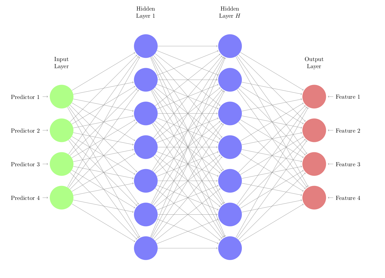
In this architecture, the functions that go from the inputs to the hidden units and between hidden units are nonlinear functions. Commonly used functions are simple sigmoids as well as ReLu functions64. The connections to the output features are typically linear. One strategy is to use a relatively small number of nodes in the hidden units to coerce the autoencoder to learn the crucial patterns in the predictors. It may also be that multiple layers with many nodes optimally represent the predictor values.
Each line in the network diagram represents a parameter to be estimated and this number can become excessively large. However, there are successful approaches, such as regularization and dropout methods, to control overfitting as well as a number of fairly efficient deep learning libraries that can ease the computational burden. For this reason, the benefit of this approach occurs when there is a large amount of data.
The details of fitting neural network and deep learning models is beyond the scope of this book. Good references for the technical details are Bishop (2011) and Goodfellow, Bengio, and Courville (2016) while Chollet and Allaire (2018) is an excellent guide to fitting these types of models65. Creating effective autoencoders entails model tuning and many other tasks used in predictive models in general. To measure performance, it is common to use root mean squared error between the observed and predicted (predictor) values, aggregated across variables.
How can autoencoders be incorporated into the modeling process? It is common to treat the relationships estimated by the autoencoder model as “known” values and not re-estimate them during resampling. In fact, it is fairly common in deep learning on images and text data to use pre-trained networks in new projects. These pre-trained sections or blocks of networks can be used as the front of the network. If there is a very large amount of data that go into this model, and the model fitting process converged, there may be some statistical validity to this approach.
As an example, we used the data from Karthikeyan, Glen, and Bender (2005) where they used chemical descriptors to model the melting point of chemical compounds (i.e., transition from solid to liquid state). They assembled 4401 compounds and 202 numeric predictors. To simulate a drug discovery project just starting up, a random set of 50 data points were used as a training set and another random set of 25 were allocated to a test set. The remaining 4327 data points were treated as unlabeled data that do not have melting point data.
The unlabeled predictors were processed by first eliminating 126 predictors so that there are no pairwise correlations above 0.75. Further, a Yeo-Johnson transformation was used to change the scale of the remaining 76 predictors (to make them less skewed). Finally, all the predictors were centered and scaled. The same preprocessing was applied to the training and test sets.
An autoencoder with two hidden layers, each with 512 units, was used to model the predictors. A hyperbolic tangent activation function was used to go between the original units and the first set of hidden units, as well as between the two hidden layers, and a linear function connected the second set of hidden units and the 76 output features. The total number of model parameters was 341,068. The RMSE on a random 20% validation set of the unlabeled data was used to measure performance as the model was being trained. The model was trained across 500 iterations and Figure 6.15(a) shows that the RMSE drastically decreases in the first 50 iterations, is minimized around 100 iterations, then slowly increases over the remaining iterations. The autoencoder model, based on the coefficients from the 100th iteration, was applied to the training and test set.

Figure 6.15: The results of fitting and autoencoder to a drug discovery data set. Panel (a) is the holdout data used to measure the MSE of the fitting process and (b) the resampling profiles of K-nearest neighbors with (black) and without (grey) the application of the autoencoder.
A K-nearest neighbor model was fit to the original and encoded versions of the training set. Neighbors between one and twenty were tested and the best model was chosen using the RMSE results measured using five repeats of 10-fold cross-validation. The resampling profiles are shown in Figure 6.15(b). The best settings for the encoded data (7 neighbors, with an estimated RMSE of 55.1) and the original data (15 neighbors, RMSE = 58) had a difference of 3 degrees with a 95% confidence interval of (0.7, 5.3) degrees. While this is a moderate improvement, for a drug discovery project, such an improvement could make a substantial impact if the model might be able to better predict the effectiveness of new compounds.
The test set was predicted with both KNN models. The model associated with the raw training set predictors did very poorly, producing an RMSE of 60.4 degrees. This could be because of the selection of training and test set compounds or for some other reason. The KNN model with the encoded values produced results that were consistent with the resampling results, with an RMSE value of 51. The entire process was repeated using different random numbers seeds in order to verify that the results were not produced stricktly by chance.
6.3.3 Spatial Sign
The spatial sign transformation takes a set of predictor variables and transforms them in a way that the new values have the same distance to the center of the distribution (Serneels, Nolf, and Espen 2006). In essence, the data are projected onto a multidimensional sphere using the following formula:
\[ x^*_{ij}=\frac{x_{ij}}{\sum^{p}_{j=1} x_{ij}^2} \] This approach is also referred to as global contrast normalization and is often used with image analysis.
The transformation required computing the norm of the data and, for that reason, the predictors should be centered and scaled prior to the spatial sign. Also, if any predictors have highly skewed distributions, they may benefit from a transformation to induce symmetry, such as the Yeo-Johnson technique.
For example, Figure 6.16(a) shows data from Reid (2015) where characteristics of animal scat (i.e., feces) were used to predict the true species of the animal that donated the sample. This figure displays two predictors on the axes, and samples are colored by the true species. The taper index shows a significant outlier on the y-axis. When the transformation is applied to these two predictors, the new values in 6.16(b) show that the data are all equidistant from the center (zero). While the transformed data may appear to be awkward for use in a new model, this transformation can be very effective at mitigating the damage of extreme outliers.

Figure 6.16: Scatterplots of a classification data set before (a) and after (b) the spatial sign transformation.
6.3.4 Distance and Depth Features
In classification, it may be beneficial to make semi-supervised features from the data. In this context, this means that the outcome classes are used in the creation of the new predictors but not in the sense that the features are optimized for predictive accuracy. For example, from the training set, the means of the predictors can be computed for each class (commonly referred to as the class centroids). For new data, the distance to the class centroids can be computed for each class and these can be used as features. This basically embeds quasi-nearest-neighbor technique into the model that uses these features. For example, Figure 6.17(a) shows the class centroids for the scat data using the log carbon-nitrogen ratio and \(\delta 13C\) features. Based on these multidimensional averages, it is straightforward to compute a new sample’s distance to each of the class’s centers. If the new sample is closer to a particular class, its distance should be small. Figure 6.17(a) shows and example for this approach where the new sample (denoted by a *) is relatively close to the bobcat and coyote centers. Different distance measures can be used where appropriate. To use this approach in a model, new features would be created for every class that measures the distance of every sample to the corresponding centroids.

Figure 6.17: Examples of class distance to centroids (a) and depth calculations (b). The asterisk denotes a new sample being predicted and the squares correspond to class centroids.
Alternatively, the idea of data depth can be used (Ghosh and Chaudhuri 2005; Mozharovskyi, Mosler, and Lange 2015). Data depth measures how close a data point is to the center of its distribution. There are many ways to compute depth and there is usually an inverse relationship between class distances and data depths (e.g., large depth values are more indicative of being close to the class centroid). If we were to assume bivariate normality for the data previously shown, the probability distributions can be computed within each class. The estimated Gaussian probabilities are shown as shadings in Figure 6.17(b).
In this case, measuring the depth using the probability distributions provides slightly increase sensitivity than the simple Euclidean distance shown in panel (a). In this case, the new sample being predicted resides inside of the probability zone for coyote more than the other species.
There are a variety of depth measures that can be used and many do not require specific assumptions regarding the distribution of the predictors and may also be robust to outliers. Similar to the distance features, class-specific depths can be computed and added to the model.
These types of features can accentuate the ability of some models to predict an outcome. For example, if the true class boundary is a diagonal line, most classification trees would have difficultly emulating this pattern. Supplementing the predictor set with distance or depth features can enable such models in these situations.
Except kernel PCA.↩
This is a situation similar to the one described above for the Box-Cox transformation.↩
We don’t suggest this as a realistic analysis strategy for these data, only to make the illustration more effective.↩
In these case, “influential” means the largest coefficients.↩
This does not imply that PCA produces components that follow Gaussian distributions.↩
NNMF can be applied to the log-transformed ridership values because these values are all greater than or equal to zero.↩
This helps prevent the model from learning a simple identity function from the data (that would provide no real value).↩
Code for the example below can be found in the books GitHub repository.↩