2.3 Exploration
The next step is to explore potential predictive relationships between individual predictors and the response and between pairs of predictors and the response.
However, before proceeding to examine the data, a mechanism is needed to make sure that any trends seen in this small data set are not over-interpreted. For this reason, a resampling technique will be used. A resampling scheme described in Section 3.4 called repeated 10-fold cross-validation is used. Here, 50 variations of the training set are created and, whenever an analysis is conducted on the training set data, it will be evaluated on each of these resamples. While not infallible, it does offer some protection against overfitting.
For example, one initial question is “which of the predictors have simple associations with the outcome?”. Traditionally, a statistical hypothesis test would be generated on the entire data set and the predictors that show statistical significance would then be slated for inclusion in a model. This problem with this approach is that is it uses all of the data to make this determination and these same data points will be used in the eventual model. The potential for overfitting is strong because of the wholesale reuse of the entire data set for two purposes. Additionally, if predictive performance is the focus, the results of a formal hypothesis test may not be aligned with predictivity.
As an alternative, when we want to compare two models (\(M_1\) and \(M_2\)), the following procedure, discussed more in Section 3.7, will be used:
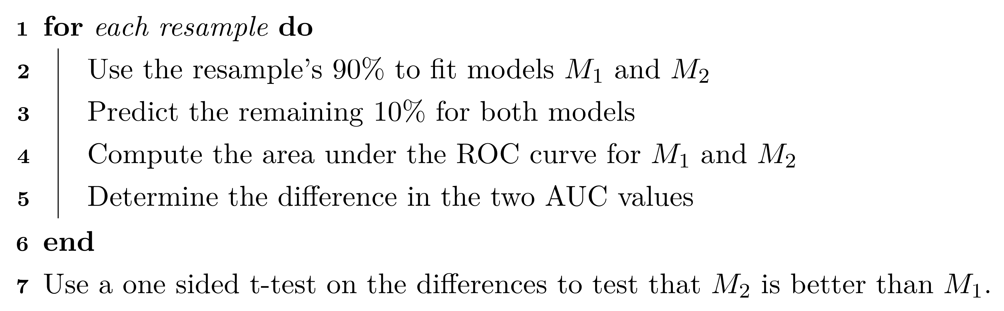
The 90% and 10% numbers are not always used and are a consequence of using 10-fold cross-validation (Section 3.4.1).
Using this algorithm, the potential improvements in the second model are evaluated over many versions of the training set and the improvements are quantified in a relevant metric13.
To illustrate this algorithm, two logistic regression models were considered. The simple model, analogous to the statistical “null model” contains only an intercept term while the model complex model has a single term for an individual predictor from the risk set. These results are presented in Table 2.3 and orders the risk predictors from most significant to least significant in terms of improvement in ROC. For the training data, several predictors provide marginal, but significant improvement in predicting stroke outcome as measured by the improvement in ROC. Based on these results, our intuition would lead us to believe that the significant risk set predictors will likely be integral to the final predictive model.
| Predictor | Improvement | Pvalue | ROC |
|---|---|---|---|
| CoronaryArteryDisease | 0.079 | 0.0003 | 0.579 |
| DiabetesHistory | 0.066 | 0.0003 | 0.566 |
| HypertensionHistory | 0.065 | 0.0004 | 0.565 |
| Age | 0.083 | 0.0011 | 0.583 |
| AtrialFibrillation | 0.044 | 0.0013 | 0.544 |
| SmokingHistory | -0.010 | 0.6521 | 0.490 |
| Sex | -0.034 | 0.9288 | 0.466 |
| HypercholesterolemiaHistory | -0.102 | 1.0000 | 0.398 |
Similarly, relationships between the continuous, imaging predictors and stroke outcome can be explored. As with the risk predictors, the predictive performance of the intercept-only logistic regression model is compared to the model with each of the imaging predictors. Figure 2.4 presents the scatter of each predictor by stroke outcome with the p-value (top center) of the test to compare the improvement in ROC between the null model and model with each predictor. For these data, the thickest wall across all cross-sections of the target (MaxMaxWallThickness), and the maximum cross-sectional wall remodeling ratio (MaxRemodelingRatio) have the strongest associations with stroke outcome. Let’s consider the results for MaxRemodelingRatio which indicates that there is a significant shift in the average value between the stroke categories. The scatter of the distributions of this predictor between stroke categories still has considerable overlap. To get a sense of how well MaxRemodelingRatio separates patients by stroke category, the ROC curve for this predictor for the training set data is created (Figure 2.5). The curve indicates that there is some signal for this predictor, but the signal may not be sufficient for using as a prognostic tool.

Figure 2.4: Univariate associations between imaging predictors and stroke outcome. The p-value of the improvement in ROC for each predictor over the intercept-only logistic regression model is listed in the top center of each facet.

Figure 2.5: ROC curve for the maximum cross-sectional wall remodeling ratio (MaxRemodelingRatio) as a stand alone predictor of stroke outcome based on the training data.
At this point, one could move straight to tuning predictive models on the preprocessed and filtered the risk and/or the imaging predictors for the training set to see how well the predictors together identify stroke outcome. This often is the next step that practitioners take to understand and quantify model performance. However, there are more exploratory steps can be taken to identify other relevant and useful constructions of predictors that improve a model’s ability to predict. In this case, the stroke data in its original form does not contain direct representations of interactions between predictors (Chapter 7). Pairwise interactions between predictors are prime candidates for exploration and may contain valuable predictive relationships with the response.
For data that has a small number of predictors, all pair-wise interactions can be created. For numeric predictors, the interactions are simply generated by multiplying the values of each predictor. These new terms can be added to the data and passed in as predictors to a model. This approach can be practically challenging as the number of predictors increases, and other approaches to sift through the vast number of possible pairwise interactions might be required (see Chapter 7 for details). For this example, an interaction term was created for every possible pair of original imaging predictors (171 potentially new terms). For each interaction term, the same resampling algorithm was used to quantify the cross-validated ROC from a model with only the two main effects and a model with the main effects and the interaction term. The improvement in ROC as well as a p-value of the interaction model versus the main effects model was calculated. Figure 2.6 displays the relationship between the improvement in ROC due to the interaction term (on the x-axis) and the negative log10 p-value of the improvement (y-axis where larger is more significant). Clicking on a point will show the interaction term. The size of the points symbolizes the baseline area under the ROC curve from the main effects models. Points that have relatively small symbols indicate whether the improvement was to a model that had already showed good performance.
Figure 2.6: A comparison of the improvement in area under the ROC curve to the p-value of the importance of the interaction term for the imaging predictors.
Of the 171 interaction terms, the filtering process indicated that 18 provided an improvement over the main effects alone when filtered on p-values less than 0.2. One of these interaction terms is between MaxRemodelingRatio and MaxStenosisByArea. Figure 2.7 illustrates the relationship between these two predictors. Panel (a) is a scatter plot of the two predictors, where the training set data are colored by stroke outcome. The contour lines represent equivalent product values between the two predictors which helps to highlight the characteristic that patients that did not have a stroke outcome generally have lower product values of these two predictors. Alternatively patients with a stroke outcome generally have higher product outcomes. Practically, this means that a significant blockage combined with outward wall growth in the vessel increases risk for stroke. The boxplot of this interaction in (b) demonstrates that the separation between stroke outcome categories is stronger than for either predictor alone.

Figure 2.7: (a) A bivariate scatter plot of the two predictors on the original scales of measurement. (b) The distribution of the multiplicative interaction between stroke outcome categories after preprocessing.